

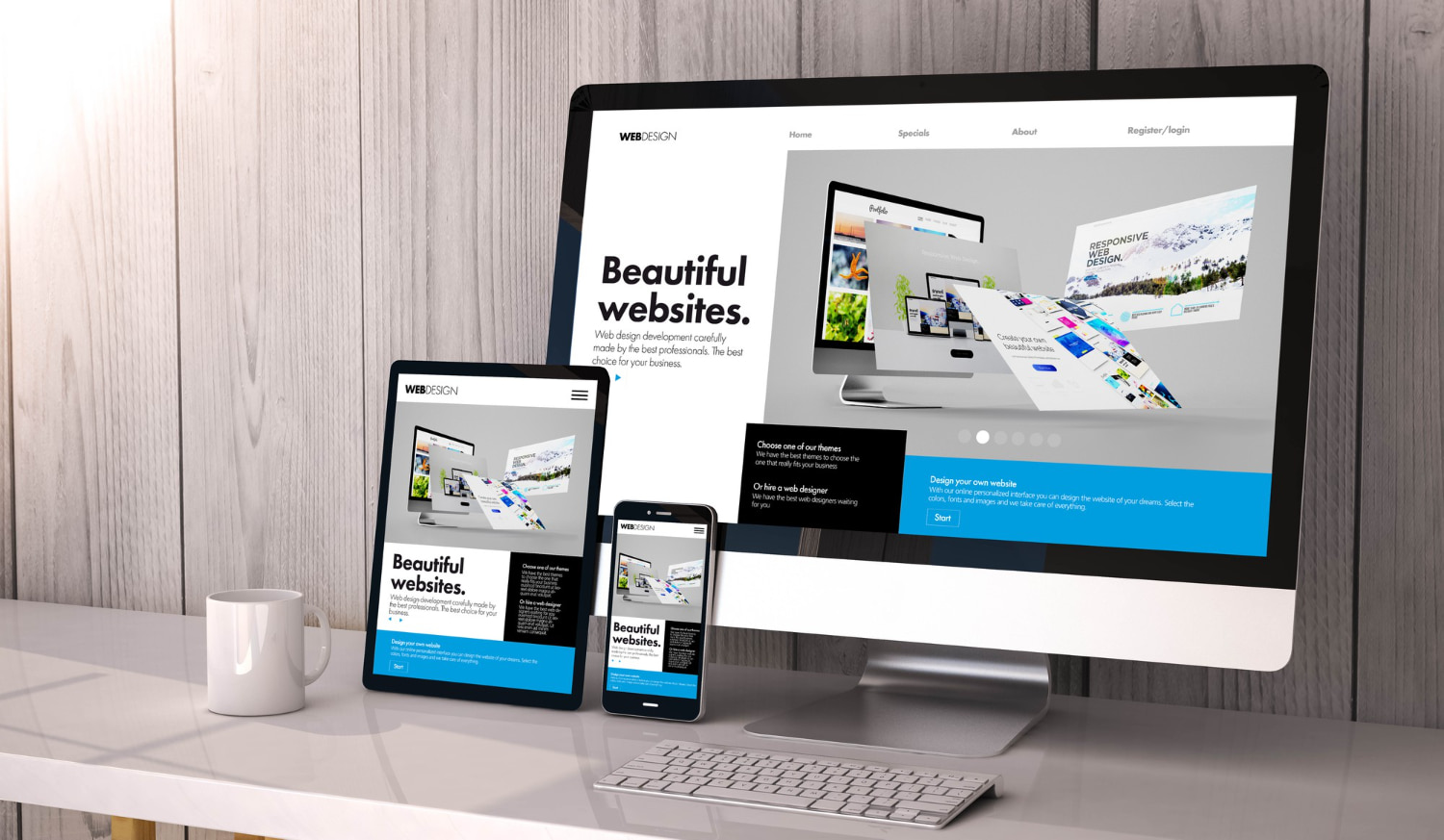


A responsive website adapts seamlessly to different screen sizes and devices, ensuring an optimal user experience and enhancing brand visibility. Understanding the key tips for creating responsive website is essential to align your brand strategy effectively and connect with your audience in today’s mobile-driven landscape. In this article, we will explore the vital techniques and best practices that will empower you to craft a responsive website that leaves a lasting impression and drives your brand’s success. Let’s delve into the world of responsive web design and unlock the potential of an immersive user experience.
What exactly is a Responsive Website?
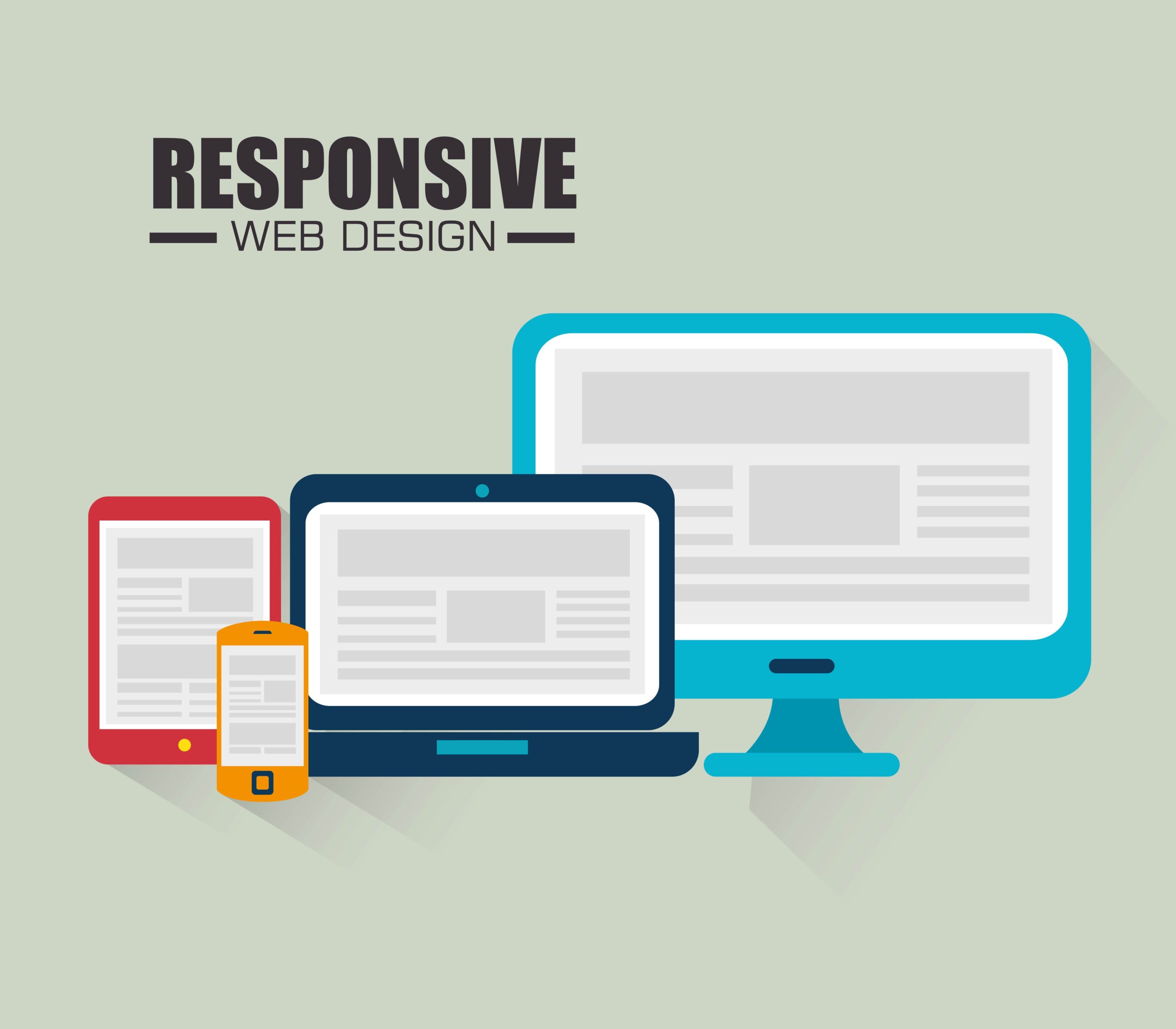
A responsive website is a design approach that allows a site to adapt and display correctly on different devices, such as desktops, laptops, tablets, and smartphones. This adaptability ensures that your website looks and functions flawlessly regardless of the screen size or orientation. Web development is based on a mobile-first approach, where the design process begins with optimizing for mobile devices and then scaling up for larger screens.
Tips for Creating Responsive Website
- Mobile-Friendly Web Design
In the era of mobile dominance, prioritizing mobile-friendliness is paramount. Opt for a mobile-friendly web design that accommodates the needs of users accessing your website from smaller screens. Consider touch-friendly elements, legible typography, and intuitive navigation to enhance user experience (UX) on mobile devices. - User Experience (UX) Optimization
User experience lies at the core of effective brand strategy. A responsive website should provide a smooth and intuitive journey for your visitors. Focus on fast-loading pages, easy-to-understand navigation, and visually appealing content to keep users engaged and satisfied with their interactions on your site. - Responsive Web Development
Embrace responsive web development practices to create a website that adjusts dynamically to various devices and screen resolutions. A well-structured responsive design ensures that your brand’s identity remains consistent across all platforms, fostering a sense of familiarity and trust among your audience. - Cross-Device Compatibility
Your website must function seamlessly across different devices and browsers. Test your site thoroughly to ensure cross-device compatibility, paying attention to functionalities such as forms, buttons, and multimedia elements. A consistent experience on all platforms will reinforce your brand’s professionalism and reliability.
- Adaptive Website Design
Incorporate adaptive design elements to cater to the specific capabilities of different devices. An adaptive website design can tailor content and features to suit each user’s context, maximizing engagement and leaving a lasting impression on your audience. - Mobile-First Approach
Adopt a mobile-first approach during the design and development process. Start by optimizing your website for mobile devices before scaling up to larger screens. This approach ensures that your website remains streamlined and user-friendly across all devices. - Media Queries and Breakpoints
Use media queries and breakpoints to make your website responsive. These tools allow your website to detect the user’s device and adjust its layout accordingly. Implementing media queries effectively will enhance the visual appeal and functionality of your website on various screen sizes. - Fluid Grid Layout
A fluid grid layout is vital for maintaining a cohesive design while accommodating different screen resolutions. Utilize relative units like percentages instead of fixed units like pixels to ensure that your website’s elements scale smoothly on all devices. - Touch-Friendly Navigation
Intuitive navigation is crucial for a positive user experience, especially on touch-enabled devices. Incorporate touch-friendly navigation elements, such as large buttons and easily accessible menus, to facilitate seamless interactions. - Fast-Loading Web Pages
Page loading speed significantly impacts user satisfaction and search engine rankings. Optimize your website’s performance by compressing images, minifying CSS and JavaScript files, and leveraging caching techniques for faster load times. - Screen Resolution Optimization
Ensure that your website elements, including images and graphics, are optimized for different screen resolutions. High-resolution displays are becoming more prevalent, and optimizing your content for such screens will enhance the overall visual appeal of your website. - Multi-Device Testing
Thoroughly test your website on a variety of devices and browsers to identify and address any responsiveness issues. Testing should cover different screen sizes, operating systems, and browsers to ensure a consistent experience for all users. - Image and Asset Optimization
Optimize images and other assets to reduce file sizes without compromising quality. Compressed images not only improve loading times but also contribute to a smoother user experience, especially on mobile devices with limited bandwidth. - Progressive Enhancement Techniques
Adopt progressive enhancement techniques to create a robust and accessible website for all users. Start with a solid foundation of core content and functionality that works across all devices and progressively add advanced features for users with modern browsers and devices. - Browser Compatibility Testing
Browser compatibility is essential to ensure that your website renders correctly on all major browsers. Perform thorough testing to verify that your website appears and functions consistently across different browsers, from Chrome and Firefox to Safari and Edge.

A responsive website is a critical aspect of your brand strategy, enabling you to connect with your target audience effectively. By following the tips and techniques outlined in this article, you can create a website that not only showcases your brand’s identity but also provides a seamless and enjoyable experience for users on any device. A well-crafted responsive website enhances user engagement, fosters trust in your brand, and positions you as a reliable and modern brand designer and strategist in the competitive digital landscape. So, invest in responsive design and make your website an integral part of your brand’s success story.


One Response