


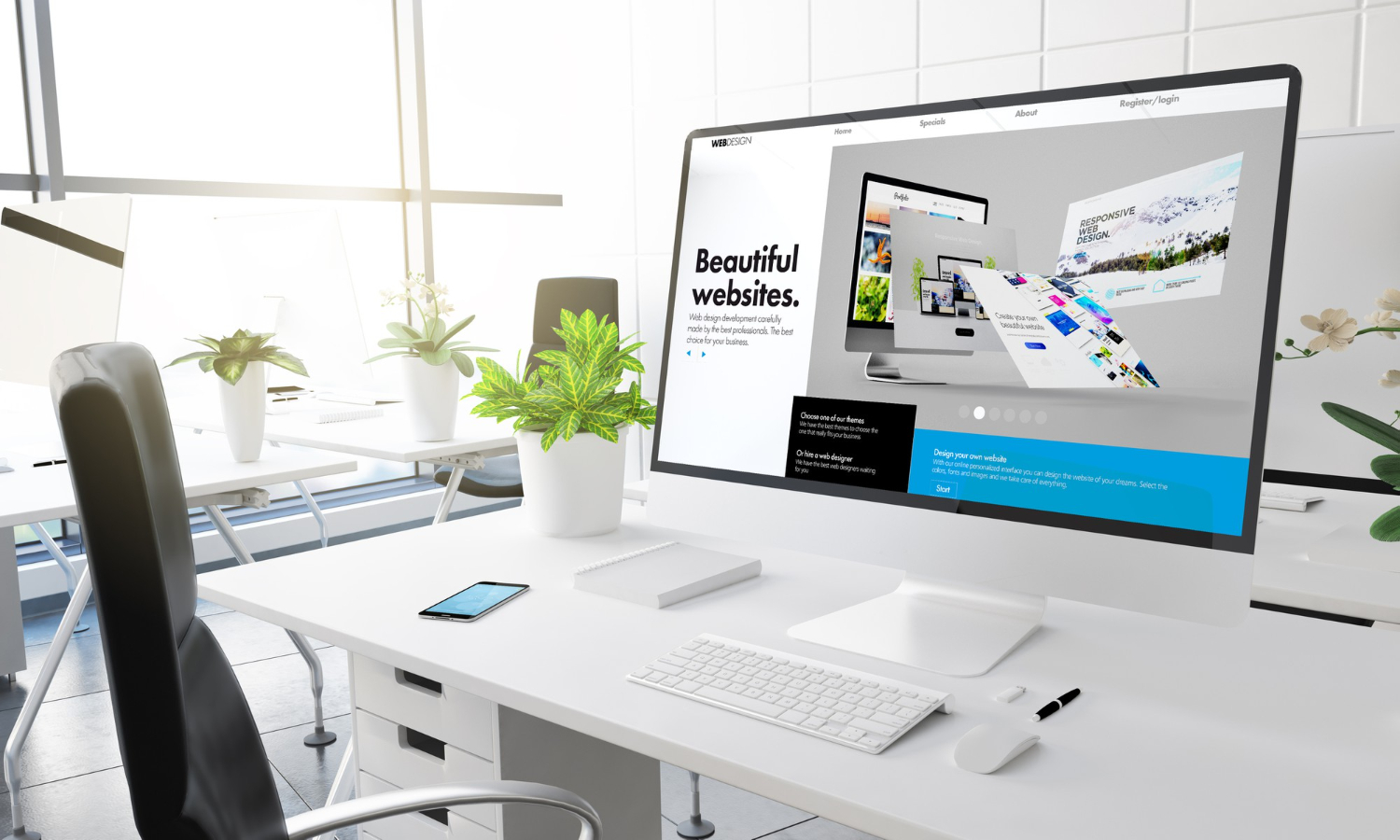
Responsive Web Design (RWD) is a modern approach to web development that ensures websites adapt to different devices and screen sizes, providing a seamless user experience. Implementing RWD involves using Adaptive Web Design Techniques, Fluid Grid Layouts in Web Development, and Flexible Images and Media. These techniques enable a website to adjust its layout, images, and content based on the user’s device and screen size.
Learn Responsive Web Design and How to Use It
Responsive Web Design (RWD) is a modern approach to web development that ensures websites adapt to different devices and screen sizes, providing a seamless user experience. Implementing RWD involves using Adaptive Techniques, Fluid Grid Layouts in Web Development, and Flexible Images and Media. These techniques enable a website to adjust its layout, images, and content based on the user’s device and screen size.

Why Responsive Web Design is Important?
The importance of responsive design cannot be overstated. In an increasingly mobile-centric world, users expect websites to provide optimal experiences on any device they use. This section will explore the reasons behind the importance of responsive web design. We will discuss how responsive websites improve user satisfaction, enhance mobile usability, increase conversion rates, and boost search engine rankings. Understanding these benefits will reinforce the significance of implementing these principles in your web development projects.
How to Design a Responsive Website
There are various processes involved in building a responsive website. Start by using a mobile-first approach when developing websites. By using this strategy, you can be confident that your website is made for smaller displays before being scaled up for larger ones. Applying various styles depending on the size of the device’s screen is possible with CSS Media Queries. Use Fluid Grid Layouts in Web Development for your website to give it a flexible and adaptive structure. To ensure that images and videos scale correctly across different devices, use Flexible Images and Media.

Best Practices for Modern Web Development
To create an efficient and user-friendly website, follow these best practices:
- Embrace Typography for Better Readability by using relative units like percentages, ems, or rems to size your text.
- Prioritize Cross-Browser Compatibility to ensure your website looks and functions well across different browsers.
- Utilize Web design frameworks and libraries like Bootstrap or Foundation to streamline the development process.
- Focus on Optimizing Performance for Websites by compressing images, minifying CSS and JavaScript files, and using browser caching.
Techniques for Efficient Web Development
Incorporating these techniques into your web development process can improve your website’s performance and user experience. Some popular techniques include:
- Adaptive Techniques: These techniques involve designing multiple layouts for different screen sizes and loading the appropriate layout based on the user’s device.
- Fluid Grid Layouts in Web Development: Fluid grids use relative units like percentages instead of fixed units like pixels, allowing your website’s layout to adjust smoothly across various screen sizes.
- Flexible Images and Media: Flexible images and media use CSS properties like max-width and height: auto to ensure that they scale proportionally and maintain their aspect ratio on different devices.
You can build a website that is interesting, educational, and user-friendly that stands out from the competition and performs better in search engine results by implementing these principles and best practises. To give your users a great reading experience, keep your language clear, readable, and correct.
How to Make a Website Responsive
This involves incorporating the aforementioned techniques and best practices. Here’s a step-by-step guide on how to make a website responsive:
- Adopt a Mobile-First Approach in Web Development by designing your website for smaller screens first and then scaling up for larger devices.
- Use CSS Media Queries for Websites to apply different styles based on the device’s screen size.
- Implement Fluid Grid Layouts in Web Development to create a flexible website structure that adapts to various screen sizes.
- Utilize Flexible Images and Media to ensure that images and videos scale appropriately across different devices.
- To ensure cross-browser compatibility, test your website on various hardware and browser combinations.
By following these steps, you can transform your website into a user-friendly platform, catering to a wide range of devices and screen sizes.
Advanced Web Design Techniques
To further enhance your website and user experience, consider implementing these advanced techniques:
- Progressive Enhancement: This approach involves designing your website with basic functionality and then progressively adding advanced features for devices with greater capabilities.
- Frameworks and libraries: Utilize popular frameworks like Bootstrap, Foundation, or Materialize to streamline the development process and ensure a consistent user experience across devices.
- Navigation: Design your website’s navigation to be easily accessible and usable on different devices, including touch-screen devices.
- Lazy Loading: Implement lazy loading techniques to defer the loading of images, videos, or other media until they are needed, improving your website’s performance.
Conclusion
Design is no longer a luxury but a necessity in the world of web development. By understanding the concepts, following best practices, and utilizing responsive design frameworks and libraries, you can create exceptional user experiences that adapt effortlessly to different devices. Embrace the power of responsive design and elevate your web development skills to new heights. By incorporating these keywords naturally throughout the article, you’ll not only enhance your on-page SEO optimization but also provide valuable insights to your readers in their journey to learn responsive web design.


One Response