Establishing a powerful and enduring brand requires understanding How To Choose Colors For Your Brand. Colours have the ability to arouse feelings, transmit ideas, and create a long-lasting effect on your audience. Nevertheless, selecting the ideal colours might be challenging given the abundance of alternatives. Fortunately, there are many tools and resources at your disposal to make this crucial decision-making process easier and more efficient.
In this post, we’ll look at a variety of tools that may help you select the best colour scheme for your branding and web design projects, develop a consistent brand colour palette, and ensure visual harmony. By incorporating these tools into your workflow, you can make informed choices that align with your brand’s personality and resonate with your target audience.
How to Choose Colors for Your Brand
Before delving into the specific tools, let’s first understand the fundamental principles of choosing colors for your brand. When it comes to color selection, it is essential to consider several factors such as your target audience, industry, and the message you want to convey. Establish the identity and values of your brand first. Are you aiming for a bold and energetic feel or a calm and sophisticated vibe? Understanding color psychology and the associations different colors evoke can be immensely helpful in communicating your brand’s personality effectively. Additionally, pay attention to color contrast, harmony, and overall visual appeal to ensure your brand stands out.
Color Palette Selection Tools
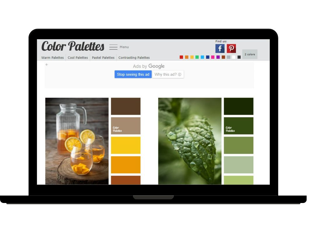
Color palette selection tools are invaluable resources that can help you explore and create harmonious color combinations. These tools offer a vast range of pre-designed color palettes that you can choose from or take inspiration from. Whether you prefer complementary, analogous, monochromatic, or triadic schemes, these tools have got you covered.
Adobe Color is a popular choice in this category, providing an extensive library of color palettes and allowing you to customize them according to your brand’s preferences. Colors and Color Hunt are other notable tools that offer an array of color palettes and inspire creativity. By utilizing these color palette selection tools, you can easily experiment with different combinations and find the perfect color palette that resonates with your brand’s identity.
Brand Color Scheme Tools
While color palettes are important, creating a comprehensive brand color scheme involves considering primary, secondary, and accent colors that work together harmoniously. Brand color scheme tools provide a holistic approach to color selection, taking into account factors such as color psychology, branding guidelines, and the emotional response you want to evoke. Canva’s Color Palette Generator offers a user-friendly interface to create and customize color schemes that align with your brand’s identity.
Paletton is another powerful tool that allows you to explore color harmonies and generate comprehensive brand color schemes. ColorSpace is also worth mentioning as it provides a curated collection of color schemes specifically designed for branding purposes. These brand color scheme tools help ensure consistency and cohesiveness across all your brand touchpoints.
Color Picker Tools for Web Design
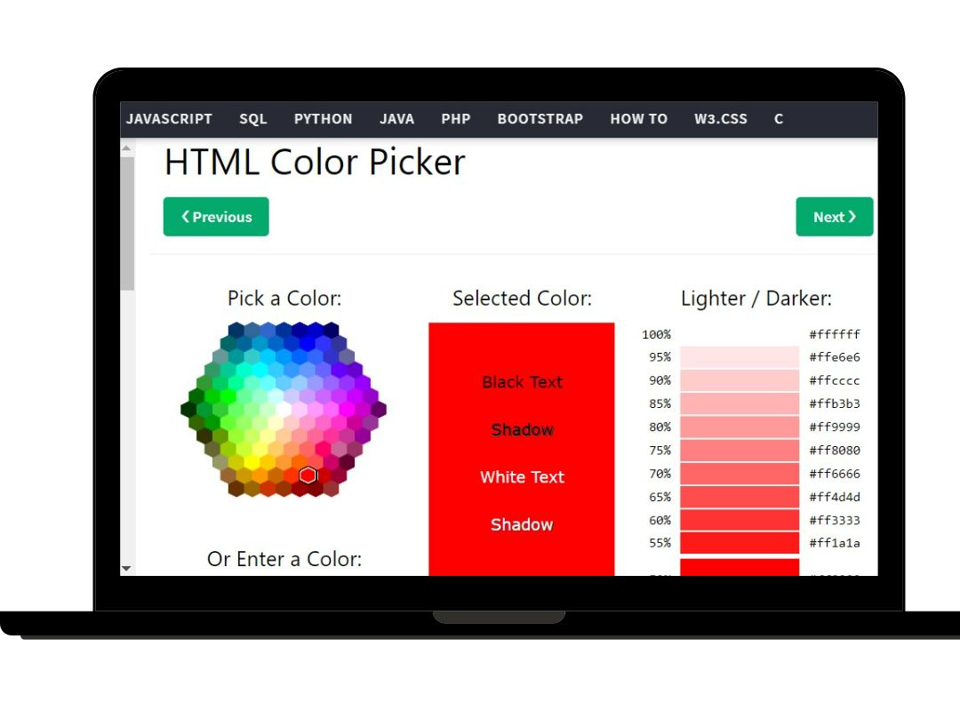
For web designers, precise color selection is essential to create visually appealing and user-friendly interfaces. Color picker tools simplify the process by providing a variety of formats such as RGB, HEX, or HSL for selecting colors. ColorZilla, a popular browser extension, offers a comprehensive color picker that allows you to extract colors from any web page. Pickr is another versatile color picker tool that provides a compact and intuitive interface for choosing colors and generating corresponding codes. Adobe Color also offers a color picker feature alongside its other functionalities. These color picker tools enable web designers to fine-tune their color choices and ensure consistent and accurate color representation across their web design projects.
Color Palette Generators for Branding
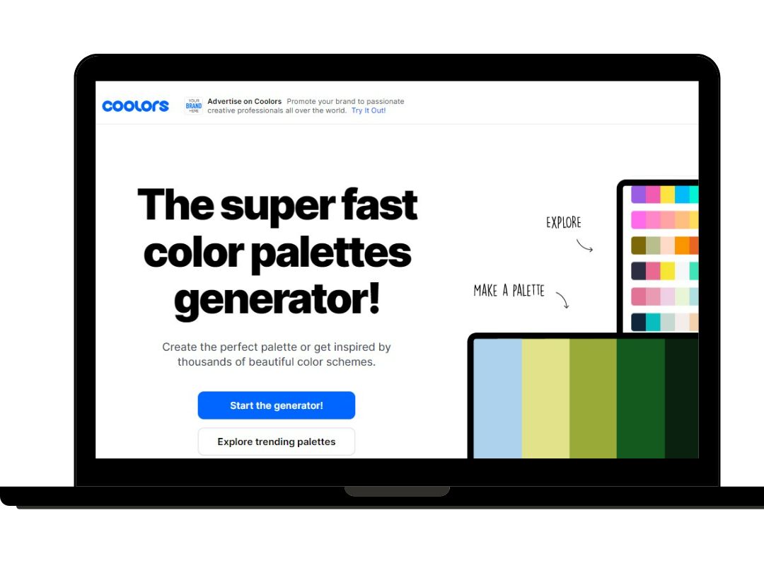
When it comes to branding, color palette generators specifically cater to the unique needs of creating a cohesive brand identity. These generators can create visually pleasing color palettes based on a single color input or even an uploaded image. Coolors, for example, allows you to generate color palettes with just a few clicks and offers a variety of customization options.
ColorSpace, on the other hand, offers a curated collection of color palettes inspired by successful brands, providing valuable insights and inspiration for your branding endeavors. Palettable is also worth exploring as it generates color palettes based on high-quality images, making it an ideal tool for finding inspiration from real-world visuals. These color palette generators assist in creating brand identities that align with your vision and resonate with your target audience.
Color Scheme Selection Tools for Web Development
In web development, color scheme selection tools go beyond aesthetics and focus on factors such as contrast, accessibility, and overall visual appeal. These tools assist developers in creating visually appealing and user-friendly websites. Contrast Checker, for instance, enables you to check the contrast ratio between text and background colors, ensuring compliance with accessibility guidelines.
Color Safe is another valuable tool that provides suggestions for accessible color combinations, allowing you to create inclusive web designs. Colorable is a color contrast tool specifically designed for web designers and developers, helping you find suitable color combinations for text, backgrounds, and other elements. These color scheme selection tools ensure your web design projects are not only visually striking but also accessible and user-friendly.
Branding Color Selection Tools
When it comes to branding, color selection goes beyond aesthetics and encompasses factors such as industry trends, target audience, and brand personality. Canva’s Color Palette Generator, in addition to its overall brand color scheme capabilities, offers valuable suggestions and guidance specifically tailored for branding purposes. Coolors and Paletton are also popular choices in this category, providing insights and inspiration for creating visually cohesive and impactful brand color schemes. By utilizing these branding color selection tools, you can ensure that your brand colors align with your industry standards, stand out from competitors, and resonate with your target audience.
Color Matching Tools for Web Design
Color matching tools are valuable resources that help you find color combinations that work well together. These tools suggest complementary, analogous, or monochromatic colors that harmonize effectively, simplifying the process of creating visually pleasing color palettes. Coolors, for example, offers a feature that generates color combinations based on selected colors, making it easy to experiment and find the perfect combinations for your web design projects.
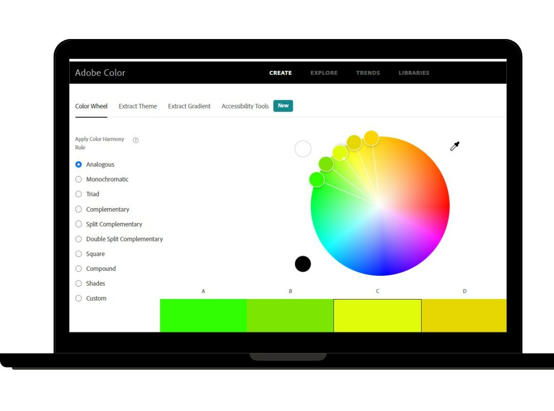
Adobe Color also provides a color matching feature alongside its other functionalities, helping you find colors that complement each other. Paletton is another notable tool that offers a range of color harmony suggestions, ensuring your web designs are visually balanced and appealing. These color matching tools save time and effort, enabling web designers to create stunning color palettes effortlessly.
Color Harmony Tools for Branding
Creating color harmony is crucial for establishing a visually cohesive brand identity. Color harmony tools provide suggestions and recommendations for achieving balanced and harmonious color palettes. Adobe Color, for instance, offers features that allow you to explore different color harmonies such as complementary, triadic, and analogous. Coolors also provides a color harmony feature that generates harmonious color palettes based on selected colors. Paletton is yet another valuable tool that offers comprehensive color harmony suggestions, helping you create brand color schemes that are visually pleasing and consistent. These color harmony tools ensure that your brand colors work together harmoniously, leaving a lasting impression on your audience.
Color Contrast Checkers for Web Development
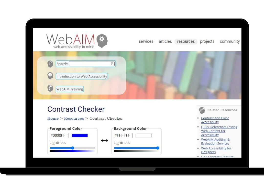
In web development, color contrast is crucial for ensuring readability and accessibility for all users. Color contrast checkers evaluate the contrast ratio between text and background colors, helping you meet accessibility standards. WebAIM’s Contrast Checker is a widely used tool that allows you to test color combinations and ensures they meet WCAG (Web Content Accessibility Guidelines) requirements. Contrast Ratio is another useful tool that provides clear feedback on contrast ratios and accessibility compliance. Accessible Colors offers a range of color contrast checking features, including options for simulating different types of color vision deficiencies. These color contrast checkers ensure that your web design projects are inclusive and accessible to everyone.
Color Psychology Tools for Branding
Color psychology plays a significant role in brand perception. Understanding the emotions and associations associated with different colors can help you create a brand identity that resonates with your target audience. Color Matters and the Pantone Color Institute are valuable resources that provide insights into the meanings behind colors and their impact on human psychology. By leveraging these color psychology tools, you can make informed decisions when selecting your brand’s color palette, ensuring that it effectively communicates the desired message and elicits the intended emotional response from your audience.


